BAKE SALE
THIS PACKAGING PROJECT WAS CREATED IN PRINT DESIGN AND THE COMPUTER DURING THE FALL ‘10
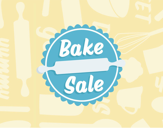
Bake Sale is a fictional bakery created to appeal to young mothers and children. Both the pie box and the cupcake box feature an original pattern consisting of illustrations of baked goods and baking tools. The bright yellow, blue, and pink color scheme was used in order to appeal to the targeted audience. On the sides of both pieces, there is a place for employees to write what is inside of each package, providing a bit real-life usability to the materials. On the other side, cheery headlines and about paragraph, set a fun and casual mood for the bakery. The logo seal, which can easily be used as a sticker for the packaging, features a friendly typeface, while the rolling pin gives the illusion of "rolling out" the logo like dough.


