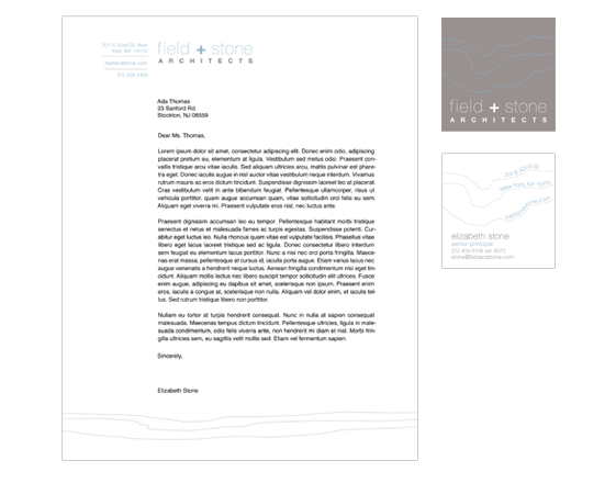
FIELD + STONE ARCHITECTS
THIS STATIONERY PROJECT CREATED IN INTERMEDIATE TYPOGRAPHY DURING THE SPRING ‘12
The stationery set was designed for an imaginary architecture firm in New York City called Field + Stone Architects. It was designed to look clean and professional, and the blue and grey color palette was inspired by architectural blueprints. The curving line motif throughout the stationery set elements was inspired by contour lines of architectural drawings, or cross sections of the land that houses are built on. The business card is square in attempts to be modern and different from more traditional architecture firms. The envelope is policy style, which is also unusual for a professional business firm. The thick and thin lines of the logo and other elements throughout the set are representative of the sturdiness and intricacy that is associated with modern architectural design. The plus sign used throughout is also a symbol of strength and addition, an appropriate motif as well.


