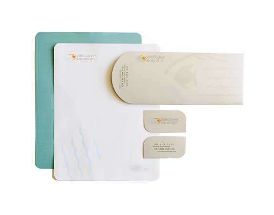
VANCOUVER AQUARIUM
THIS STATIONERY PROJECT WAS CREATED IN PRINT DESIGN AND THE COMPUTER DURING THE FALL ‘10
The Vancouver Aquarium was initially recognized for its orca whale research but the aquarium is also a tourist attraction and a center for marine preservation and rehabilitation. The goal of the redesign was to more accurately represent the aquarium by showing the relationship between humans and aquatic ecosystems. The five wavy lines are an allusion to the Vancouver flag where the ribbons symbolize the Pacific ocean and surrounding rivers. The fish, seaweed and wave add flow to the logo, helping to illustrate the harmony between humans and the sea.


