work
Packaging
Prime
Prime
Design for Print: Digital and Analog | Dan Banks | Fall '12
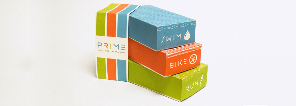
This packaging for an imagined brand delivers triathlon training starter packs to first time racers. With bright colors and playful icons, Prime’s look reflects the encouraging tone of its service. The logo’s incomplete letterforms reinforce the active and ongoing process of training and competing, and the bars of the E mirror the packaging’s color separation of each leg of the race.
The Contender
Hannah Karl is a senior majoring in Graphic Design.
You can check out more of her work here:
www.hannahkarl.com


