Conprisa
Branding

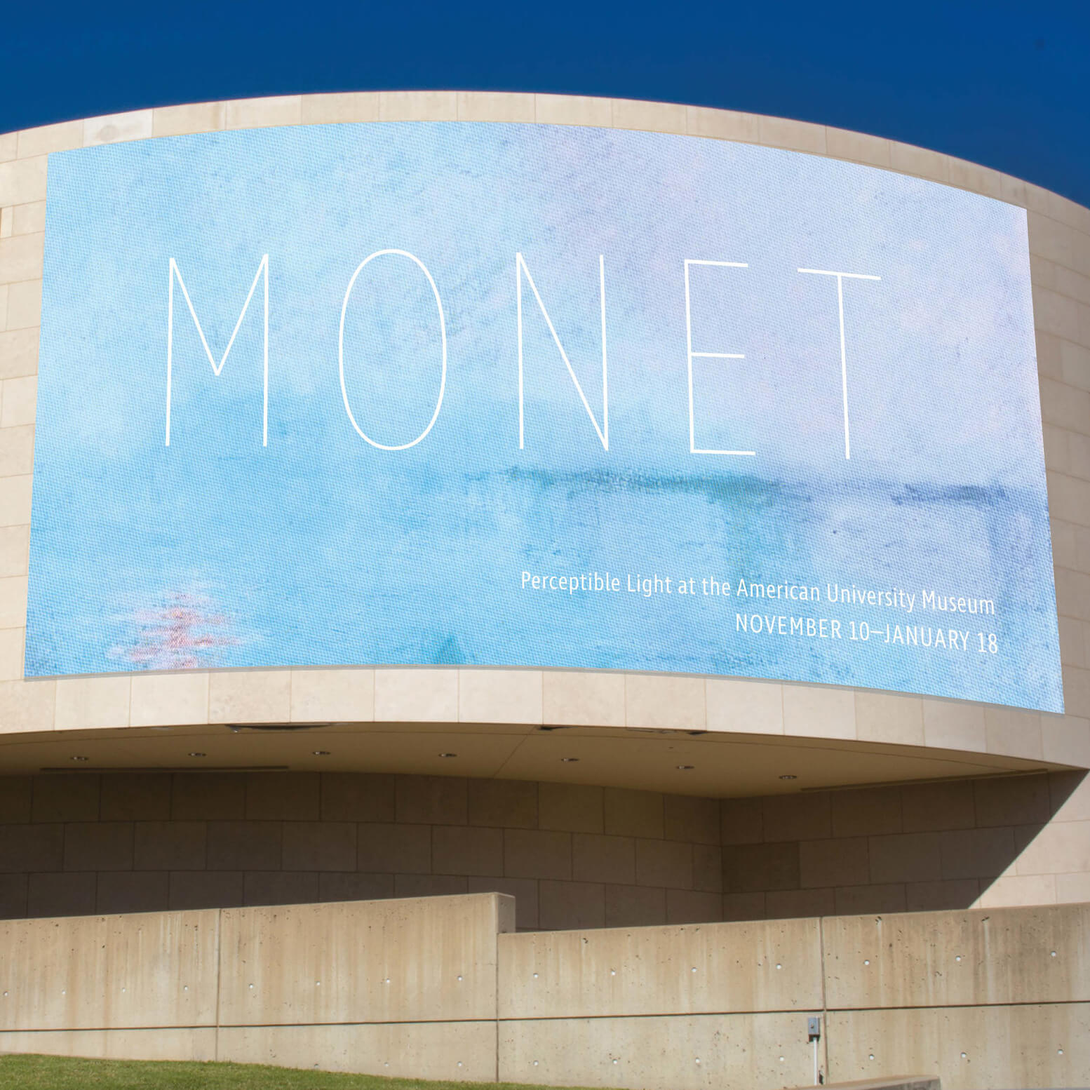
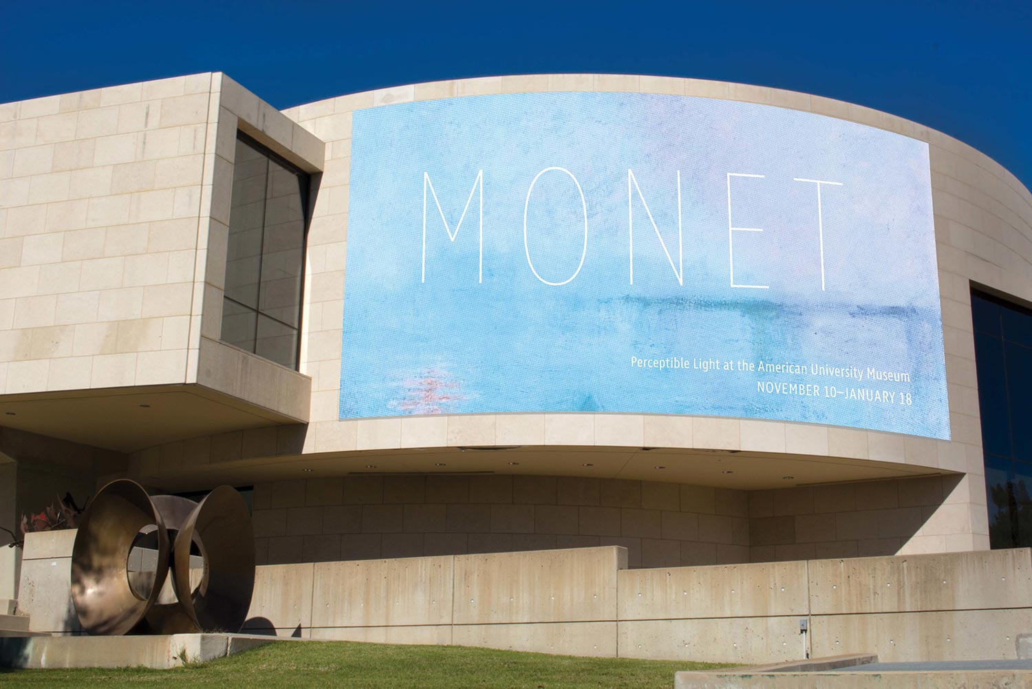
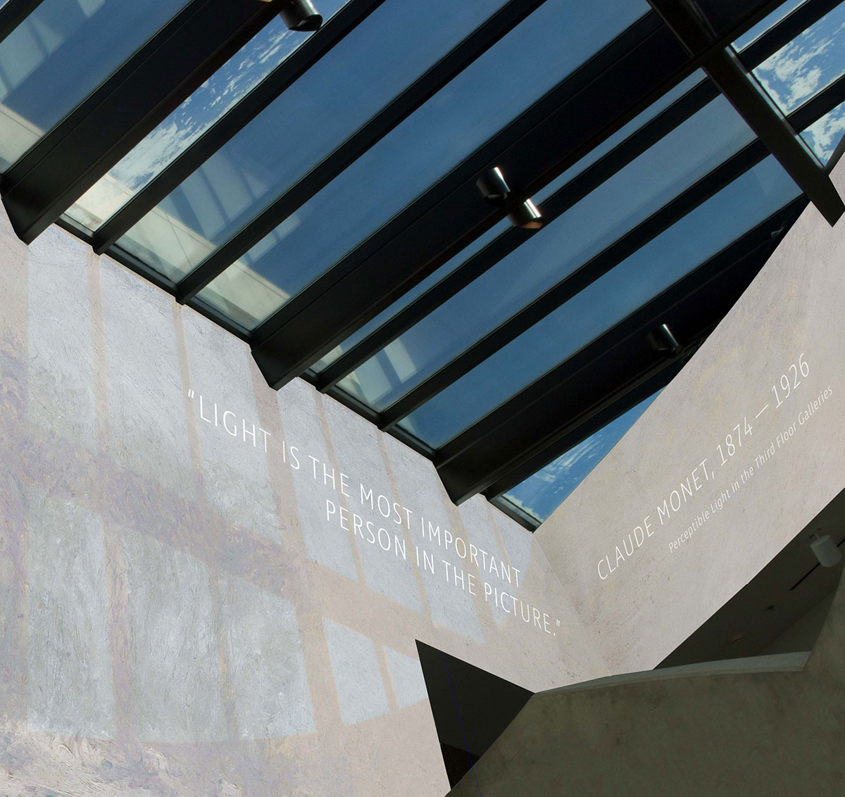
For this Monet exhibition, I decided to focus on light, as it is so integral to Monet's work and often considered his true subject. Since a defining aspect of Impressionism is the changing nature of light, I reflected this in the exhibition signage by planning my designs around materials that change in varying light conditions.
On the building exterior and gallery entry, a photochromic ink will be painted over the signs that will be transparent in the shade but will transform the color of Monet's work in the light (as shown in the photo mockups, where the signs are seen in different colors in the light and shade).
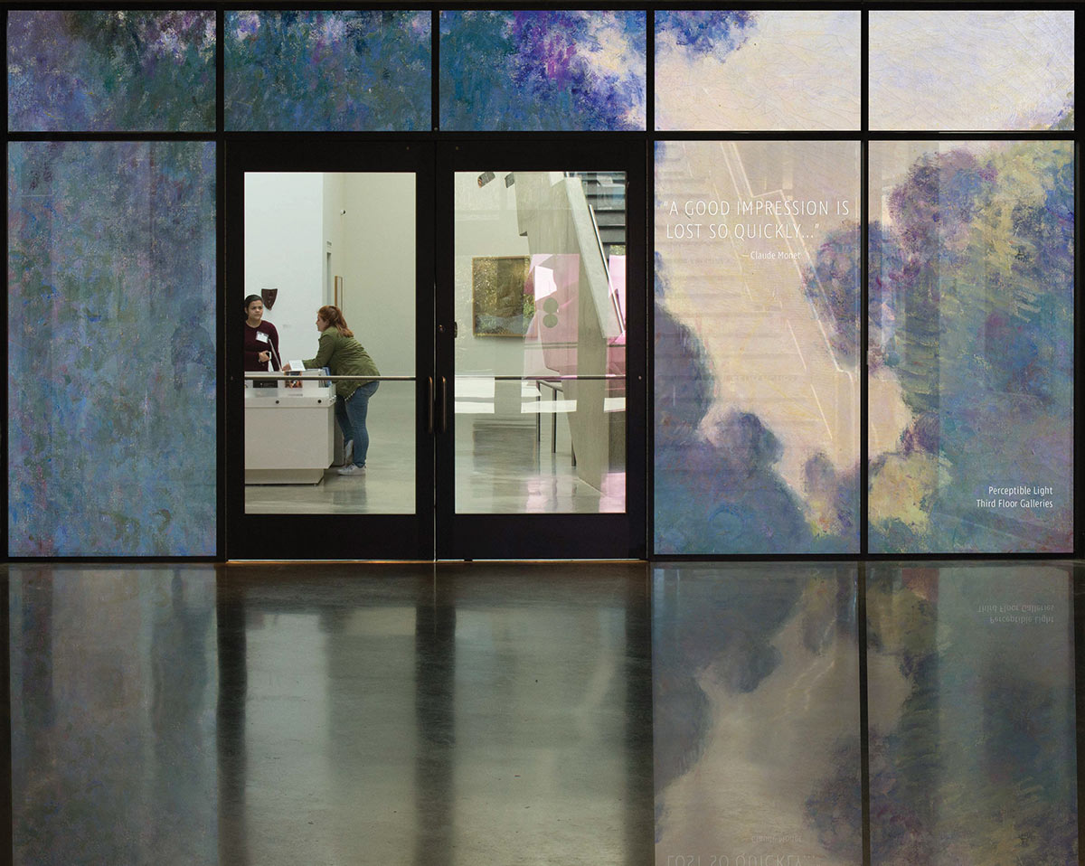
For the museum entry, I took advantage of the huge glass doors to play with reflection, placing a translucent print of Monet's painting on the window that will reflect onto the floor when light comes through the door.


