End Gender Inequality
Poster

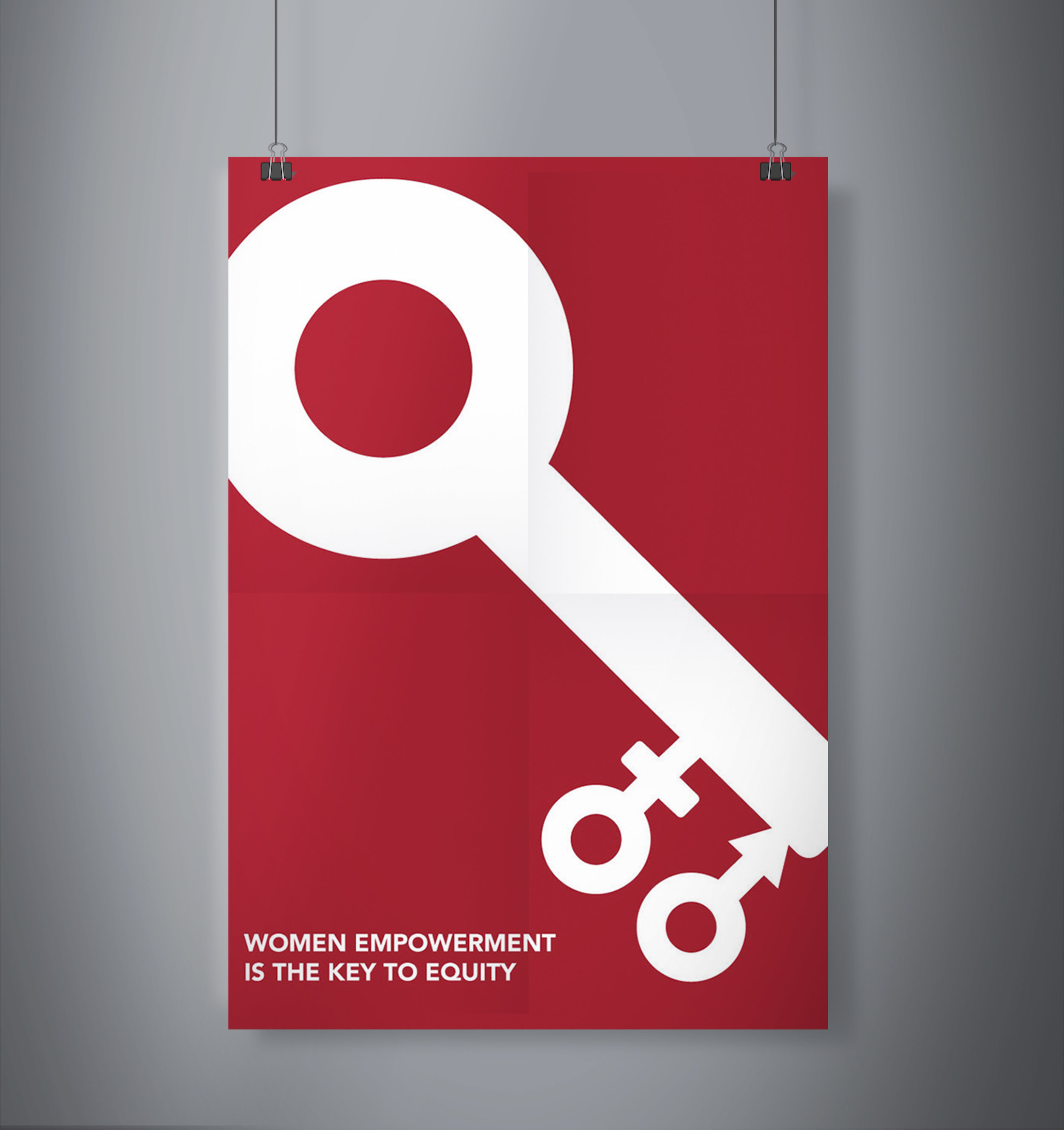
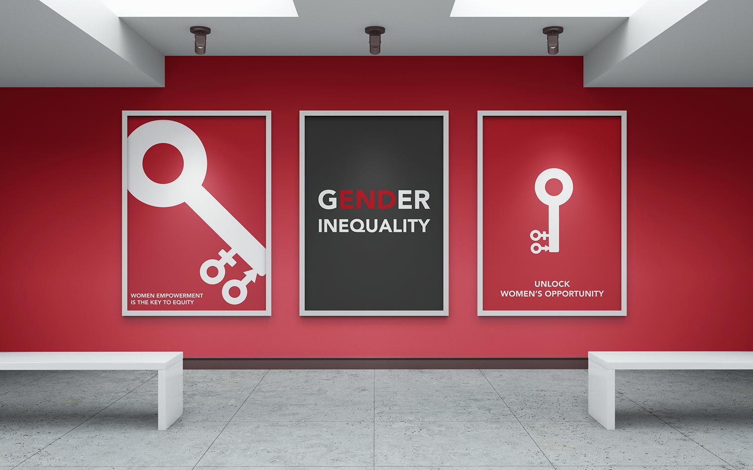
For the grey poster I put emphasis on the word, end, in gender and through the use of color I hoped to better the readability of the phrase, end gender inequality. I also positioned the words gender and inequality on top of each other as if it were an equal sign to convey the equality aspect of the message. In the red posters I utilized the mars and venus sex symbols in place of the ridges on a key to capture the metaphor in the phrases on the posters
For all of the posters I made the decision to use gray, white, and red which are colors one would not immediately associate with gender related matters and visuals but I wanted to steer clear from using blue and pink to represent male and female respectively because they promote the notion of gender roles and stereotypes. So I used more neutral colors like grey and white and utilized red because it is a more glaring color that would indicate the need for a call to action.

