Lush Visual Identity
by Ada Thomas
Advanced Design I: Visual Branding and Design Systems
|Chemi Montes
|Fall 2013
|Identity
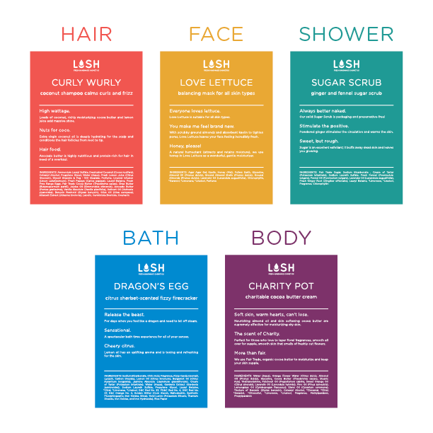
The designs for this brand Identity and implementation project were based on the company's fresh, handmade, high quality, and environmentally conscious cosmetic products.
The U in the logotype can be interpreted in many ways by the viewer, such as a mortar and pestle or a drop of water--which can suggest either the handmade or the fresh and cleansing attributes of the products.
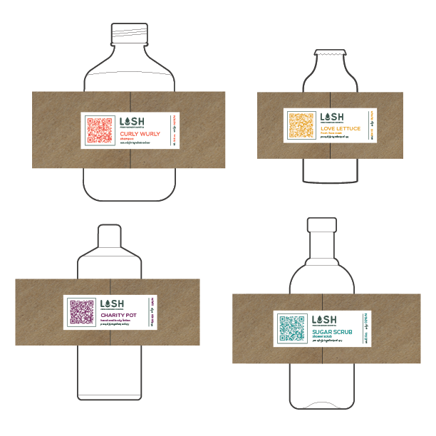
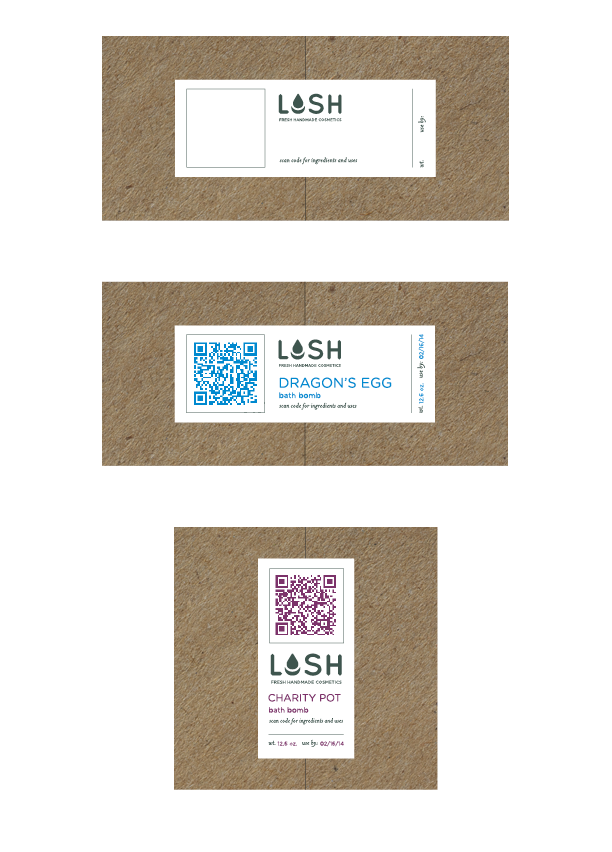
To minimize packaging, customers will be encouraged to bring their own containers or they will use the reusable bottles and jars available in the store. Each product will be hand filled into a container and given a custom label or wrapper upon purchase, which highlights its freshness, its sustainability, and its unique match for the customer.
Design elements both in store and on packaging highlight the ingredients of the products and the values of the company. The custom printed labels act as stickers and utilize QR codes to provide further information without using additional paper or packaging.