THE CORCORAN GROUP
THIS STATIONERY PROJECT WAS CREATED IN PRINT DESIGN AND THE COMPUTER DURING THE SPRING ‘12
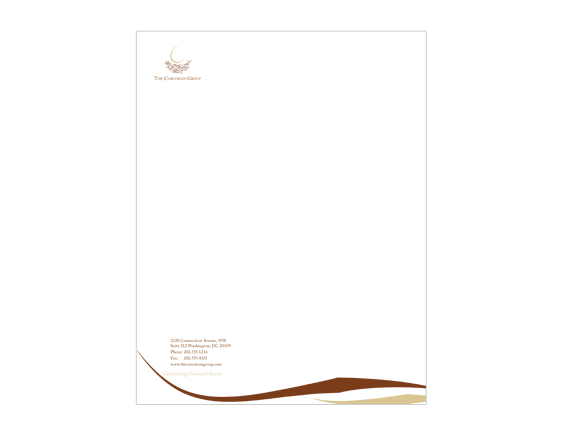
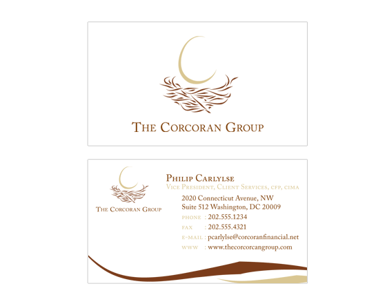
“The Corcoran Group” is a logo design combined with a four piece stationery package design, for a local financial group.
My logo, which uses the visual image of a single egg in a nest, is based off of the idea that The Corcorcan Group can be a safe place for you to place all of your eggs (going off of the saying that you shouldn’t place your eggs all in one basket). It is attempting to convey the message that we know your money is important, and you can trust us with it. Also, with The Corcoran Group acting as a nest, your money will be taken care of and it will certainly grow and develop. The one egg that is placed in the nest also subtly forms a “C”, for the Corcoran Group.
The various stationery elements incorporate a radial gradient that recalls the surface of an egg and how it looks when the light hits it at an angle, as well as two simple embellishing lines taken from the nest.


